DIV 가로 중앙 정렬, 세로 중앙 정렬
코딩을 할 때 가장 기본이 되지만 또 가장 어려웠던 부분이었다.
display:flex; 이 코드를 알고 나서 정말 쉽게 코딩이 가능해졌다.
바깥쪽 div, 즉 부모 div에 display:flex; 를 선언하면. 안쪽 엘리먼트, 즉 자식div에 영향을 준다.
반응형 레이아웃을 작업할 때 유용하게 쓸수 있는 css입니다.
사이트선택 전용 레이아웃을 코딩할때 사이트제목2개를 중앙에 배치하는 부분이 무척 힘들었었는데
display:flex; 코드를 사용하니 쉽게 구현이 가능해 졌다.
<style>
.bl-left { position:relative; float:left; width:50%; height:300px; display: flex; justify-content: center; align-items: center; }
.bl-right { position:relative; float:right; width:50%; height:300px; display: flex; justify-content: center; align-items: center; }
.bluelight { position: relative; display: table; width: 150px; height: 150px; }
.bluelight a { display: table-cell; vertical-align: middle;text-align: center; }
</style>
<div class="bl-left">
<span class="bluelight">
<a href="#">MH</a>
</span>
</div>
<div class="bl-right">
<span class="bluelight">
<a href="#">Moon</a>
</span>
</div>
위의 코딩으로 완성된 사이트제목2개의 가로,세로 정렬 모습입니다.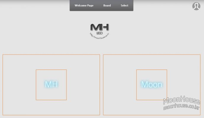
 DIV 화면 정중앙에 박스 배치하기
 커서(cursor) 모양 정리
 자료가 도움이 되었다면 댓글과 평가 부탁합니다.


