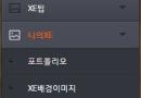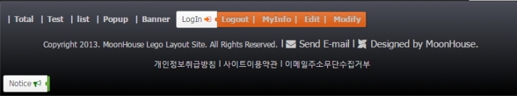
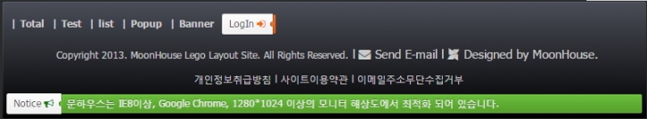
마우스오브시 상단의 이미지와 같이 로그인메뉴가 나오고 알림글이 우측으로 펼처져 출력되게 하는 방법입니다.
아이디어에 따라서 다양한 출력이 가능하겠죠.
* 먼저 css파일에 추가할 코드
/* Accordion Toggle */
.ubt { text-align:left; list-style: none; padding:5px; margin:0 Auto; }
.ubt { zoom: 1; }
.ubt:before,
.ubt:after { content: ''; display: table; }
.ubt:after { clear: both; }
.ubt a { text-decoration:none; }
.ubt li { position: relative; float: left; margin: 0; }
.ubt li:active { margin-top: 1px; margin-bottom: 7px; }
.ubt li:after { content: ''; z-index: 2; position: absolute; top: 10px; right: -2px; width: 5px; height: 6px; opacity: .95; background: #eb6b22; border-radius: 3px 0 0 3px; -webkit-box-shadow: inset 1px 0 #99400e; box-shadow: inset 1px 0 #99400e; }
.ubt span { position: absolute; top: 1px; left: 100%; z-index: 2; overflow: hidden; max-width: 0; height: 24px; line-height: 21px; padding: 0 0 0 2px; color: white; text-shadow: 0 -1px rgba(0, 0, 0, 0.3); background: #eb6b22; border: 1px solid; border-color: #d15813 #c85412 #bf5011; border-radius: 0 2px 2px 0; opacity: .95; background-image: -webkit-linear-gradient(top, #ed7b39, #df5e14); background-image: -moz-linear-gradient(top, #ed7b39, #df5e14); background-image: -o-linear-gradient(top, #ed7b39, #df5e14); background-image: linear-gradient(to bottom, #ed7b39, #df5e14); -webkit-transition: 0.3s ease-out; -moz-transition: 0.3s ease-out; -o-transition: 0.3s ease-out; transition: 0.3s ease-out; -webkit-transition-property: padding, max-width; -moz-transition-property: padding, max-width; -o-transition-property: padding, max-width; transition-property: padding, max-width; }
.ubt p, s, .ubt span { display: block; -webkit-box-sizing: border-box; -moz-box-sizing: border-box; box-sizing: border-box; }
.ubt p, s { height: 26px; line-height: 23px; padding: 0 9px 0 8px; font-size: 12px; color: #555; text-decoration: none; text-shadow: 0 1px white; background: #fafafa; border-width: 1px 0 1px 1px; border-style: solid; border-color: #dadada #d2d2d2 #c5c5c5; border-radius: 3px 0 0 3px; background-image: -webkit-linear-gradient(top, #fcfcfc, #f0f0f0); background-image: -moz-linear-gradient(top, #fcfcfc, #f0f0f0); background-image: -o-linear-gradient(top, #fcfcfc, #f0f0f0); background-image: linear-gradient(to bottom, #fcfcfc, #f0f0f0); -webkit-box-shadow: inset 0 0 0 1px rgba(255, 255, 255, 0.7), 0 1px 2px rgba(0, 0, 0, 0.05); box-shadow: inset 0 0 0 1px rgba(255, 255, 255, 0.7), 0 1px 2px rgba(0, 0, 0, 0.05); }
.ubt p:hover span { padding: 0 7px 0 6px; max-width: 1000px; -webkit-box-shadow: inset 0 0 0 1px rgba(255, 255, 255, 0.15), 1px 1px 2px rgba(0, 0, 0, 0.2); box-shadow: inset 0 0 0 1px rgba(255, 255, 255, 0.15), 1px 1px 2px rgba(0, 0, 0, 0.2); }
.ubt s:hover span { padding: 0 7px 0 6px; max-width: 1000px; -webkit-box-shadow: inset 0 0 0 1px rgba(255, 255, 255, 0.15), 1px 1px 2px rgba(0, 0, 0, 0.2); box-shadow: inset 0 0 0 1px rgba(255, 255, 255, 0.15), 1px 1px 2px rgba(0, 0, 0, 0.2); }
.greena li:after { background: #65bb34; -webkit-box-shadow: inset 1px 0 #3a6b1e; box-shadow: inset 1px 0 #3a6b1e; }
.greena span { background: #65bb34; border-color: #549b2b #4f9329 #4b8b27; background-image: -webkit-linear-gradient(top, #71ca3f, #5aa72e); background-image: -moz-linear-gradient(top, #71ca3f, #5aa72e); background-image: -o-linear-gradient(top, #71ca3f, #5aa72e); background-image: linear-gradient(to bottom, #71ca3f, #5aa72e); }
.bluea li:after { background: #56a3d5; -webkit-box-shadow: inset 1px 0 #276f9e; box-shadow: inset 1px 0 #276f9e; }
.bluea span { background: #56a3d5; border-color: #3591cd #318cc7 #2f86be; background-image: -webkit-linear-gradient(top, #6aaeda, #4298d0); background-image: -moz-linear-gradient(top, #6aaeda, #4298d0); background-image: -o-linear-gradient(top, #6aaeda, #4298d0); background-image: linear-gradient(to bottom, #6aaeda, #4298d0); }
1. 로그인메뉴 추가방법
<style>
.ubt s:hover span { width: 230px; }
</style>
<div cond="$layout_info->b_menu_Login == 'Y'" class="ubt">
<li><s>LogIn <i class="fa fa-sign-in" aria-hidden="true" style="color:#ff6600;"></i><span>
<!--@if($logged_info)-->
<a href="{getUrl('act','dispMemberLogout')}" style="color:{$layout_info->bt_text_color};">Logout |</a>
<a href="{geturl('act','dispMemberInfo')}" style="color:{$layout_info->bt_text_color};">MyInfo |</a>
<!--@else-->
<a href="{getUrl('act','dispMemberLoginForm')}" style="color:{$layout_info->bt_text_color};">Login |</a>
<a href="{getUrl('mid',$layout_info->target_mid,'act','dispMemberSignUpForm')}" style="color:{$layout_info->bt_text_color};">Join |</a>
<!--@end-->
<!--@if($logged_info->is_admin == "Y")-->
<a href="{getUrl('act','dispLayoutAdminEdit','layout_srl',$layout_info->layout_srl)}" style="color:{$layout_info->bt_text_color};">Edit |</a>
<a href="{getUrl('act','dispLayoutAdminModify','layout_srl',$layout_info->layout_srl)}" style="color:{$layout_info->bt_text_color};">Modify |</a>
<a href="{getUrl('','module','admin')}" " onclick="window.open(this.href); return false;" style="color:{$layout_info->bt_text_color};">Admin |</a>
<!--@else-->
<a href="javascript:bookmarksite('{$layout_info->fa}', '{$layout_info->index_url}')" style="color:{$layout_info->bt_text_color};">Bookmark |</a>
<!--@end-->
</span></s></li>
</div>
2. 알림내용 추가방법
<style>
.ubt p:hover span { width:{$layout_info->bodyWrap_width-80}px; }
</style>
<ul cond="$layout_info->b_text_toggle == '' && $layout_info->b_text1" class="ubt greena" style="width:{$layout_info->bodyWrap_width}px;">
<li><p>Notice <i class="fa fa-bullhorn" aria-hidden="true" style="color:green"></i><span>{$layout_info->b_text1}</span></p></li>
</ul>
<ul cond="$layout_info->b_text_toggle == '' && $layout_info->b_text2" class="ubt bluea" style="width:{$layout_info->bodyWrap_width}px;">
<li><p>Notice <i class="fa fa-bullhorn" aria-hidden="true" style="color:blue"></i><span>{$layout_info->b_text2}</span></p></li>
</ul>
레이아웃설정 코드는 알아서 주셔야 합니다. {$layout_info->b_text1}
[중요]
1. 상단의 이미지와 같이 2개 이상의 버턴을 출력할려면 .ubt s, .ubt p와 같이
s 와 p 같은 분류자로 나누어 주어야 가로 넓이를 다르게 줄 수 있습니다.
2. 색상출력
class="ubt" - 오렌지색상
class="ubt greena" - 그린색상
class="ubt bluea" - 블루색상

 레이아웃에 팝업창 띄우기
 Wing영역 아코디언메뉴 생성하는 방법