
-

- (*.133.26.238)
- 2010.02.20 - 00:38 2008.04.04 - 00:21 12863 2
안녕하세요. 오랜만에 뵙습니다.
눈을 다치셨다가 다 나으셔서 제로보드에서 최근게시물 위젯등을 올리시며
활발하게 활동하시는 모습 보기 좋습니다.
초보자 입장에서 지금 한창 레이아웃과 css에 대해 연구하고 있는데, 잘 안되네요.
제가 궁금한 것은 지금 시험중인 홈사이트에 다른 레이아웃을 적용하면서
연습중인데, 톱부분에 공백이 많아 이걸 어떻게 줄이는지 아무리 해도 안되어
질문드립니다. 그림에서 보면요...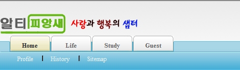
로고부분 바로 위 부분이 너무 공간이 넓은 것 같아 이걸 줄이려고 하는데요.
아마도 Css파일을 손봐야 할 것 같아 파일을 첨부합니다.
어느 부분을 어떻게 손봐야 하는지 좀 알려주세요...
참고로 제가 연습중인 홈 사이트는 http://rotcblue.cafe24.com

혀나겅주님 오랜만이네요. 반갑습니다.
요즘은 zbxe사이트에서도 종종 혀나겅주님의 모습이 보이더군요. 반갑더군요.....
님이 주신 css파일 하나만 가지고 정확하게 분석을 할 수가 없더군요.
layout.html파일도 같이 봤어면 정확한 답변 드릴 수 있었을 것 같은데요..
css파일로만 봐서는
#top { position:relative; width:980px; height:55px; }
#top h1 { position:absolute; margin:0; top:10px; left:0px;}
#top .quickmenu { position:absolute; margin:0; top:0px; right:0px; width:290px; height:30px; }
#top .join { position:absolute; margin:0; top:25px; right:5px; height:40px; overflow:hidden; white-space:nowrap; }
#header { position:relative; width:980px; height:70px; margin-bottom: 5px; background:url(../images/default/bgHeader.gif) no-repeat right top; z-index:98;}
정확한 답변이 아니라 죄송합니다.
그럼 좋은 밤 되세요.